css-display
参考文章 https://css-tricks.com/almanac/properties/d/display/
div {
    display: inline;
    display: inline-block;
    display: block;
    display: run-in;
    display: none;
}
Inline
像<span>, <em>, <b>这些包围text的元素并不会截断文字流(flow of the text).
inline 元素可以接受 margin 和 padding 设置,但是元素依然是按照inline表现,margin 和 padding 只会在水平上撑开元素,垂直方向上不会。
inline 元素不接受 height 和 width 设置,会直接忽略。
Inline Block
inline-block元素和 inline 很像,依据文字流布局(在 baseline 上)。
区别就是可以设置 width 和 height.
Run-in
首先,这个属性不支持Firefox。
。。。
None
从页面中移除元素,不占据空间。
Table values
有一系列的设置可以让非 table 元素强制按照 table 元素的行为来表现。
div {
    display: table;
    display: table-cell;
    display: table-column;
    display: table-colgroup;
    display: table-header-group;
    display: table-row-group;
    display: table-footer-group;
    display: table-row;
    display: table-caption;
}
要使用它,就模仿正常的 table 结构:
<div style="display: table;">
<div style="display: table-row;">
<div style="display: table-cell;">
Gross but sometimes useful,
</div>
</div>
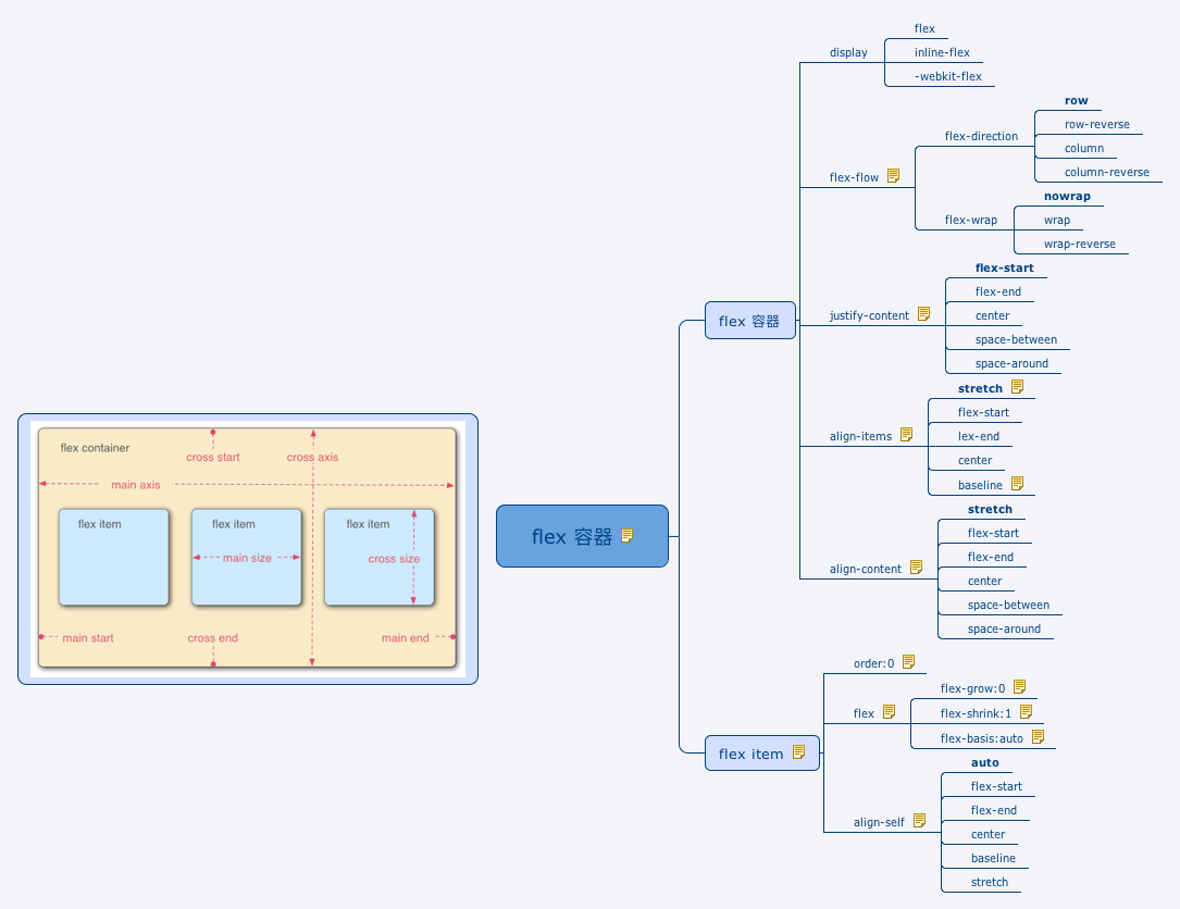
</div>Flexbox
.header {
    display: flex;
}
参见 flex 相关介绍。
Grid
Grid 布局也是通过 display 属性初始化的。
body {
    display: grid;
}
不过至今只有IE 10 支持它。 技术标准见这里.